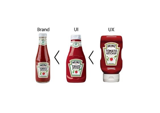
If you’ve been brave enough to dive into this article and haven’t run away when reading its title, we assume that you have an idea, albeit a basic one, about UX design and UI design (or that you would at least like to have one).
These two design disciplines that marketers tend to condense into an acronym, actually respond to two seemingly very simple concepts to achieve: that the end user does not get lost and spends as much time as possible on a website or on a website. app. However, as you can imagine, they have more science than meets the eye.
UX and UI design, very different from graphic and web design itself, complement an attractive appearance with knowledge of marketing and advanced analytics to achieve your goals. That is why it is very easy for the profile of a specialist in UX and UI design to be multidisciplinary.
The UX or user experience design is one that is responsible for the usability and interaction of a website or an app. The first thing the UX designer will ask a client is: what do you hope to achieve with this page? Many people want to have a website simply as a business card, but others see it as a new sales channel or as a hook to attract potential new customers.
In this way, an online sales website will not have the same needs at all as, for example, an English school. One will seek you to buy their product, while the other will focus on getting as many phone numbers or contact details as possible to call.
The UX design raises these needs from various approaches and carries out a continuous monitoring of A / B tests and practices that, like the secret formula of Coca Cola, are jealously guarded in each agency. For example, does the number of clicks change a lot if we put the button on the right instead of on the left? What if we change it from blue to green?
These tiny changes start from the design of a wireframe, which is nothing more than a diagram or draft of the structure of the web page, and end up having a resounding impact on the client’s objectives.
And in the end there are several points that must be taken into account to obtain a well-sketched, analyzed and executed UX design:
- Purpose of the web: as we have commented previously, it is not the same that our product is an e-commerce, that the purpose is always the purchase and sale, that it is a web that is destined to establish contact.
- Device / s for which we will develop the product. We must take into account the physical possibilities of each device. Designing for a computer screen is not the same as designing for a tablet or smartphone. In this case, one of the first details that any good UX designer takes into account is to facilitate the fact that you can press the buttons of the web while holding the phone with one hand. Practical! True?
- Loading speed. Imagine that the web in a huge portfolio of images: the UX designer will have to distribute the information in such a way that the user does not see that there is a back loading process while browsing the web.
- Usability. Usability always has to be easy and intuitive for the user. In this way you do not get lost and leave the page at the first change.
- Special needs: for example, city council websites (and ideally all the ones we design) should take into account the way people with reduced vision navigate. This forces to rethink practically the entire web.
Now that we are clear about what the UX is … how is this different from the UI? First of all you have to know that UI stands for User Interface. This is responsible for the graphic part of the design of a web page or app, that is, the phase in which we give it a visual identity and personality.
To be a good web designer, it is not enough to have good taste. Web design relies on a series of intricate rules that make items and menus navigable, represent the spirit of the company, and perfectly convey the brand message.

